Marking a significant shift in approach to seasonal menu design, The Route 66 Menu at Pouring Ribbons, launched Fall 2015, chose thematic inspiration as a way of reinvigorating the creative process for bartenders weary from developing cocktails inspired only by the changing of the weather. From a design perspective, this meant reinterpreting three full years of consistent branding in such a way that would embrace the chosen theme while respecting the existing Pouring Ribbons identity that had become so well established.
As a solution, the menu maintains most of it's pre-existing structural elements: the shape of the logotype, page format, the cocktail matrix that plots drinks on a scale of comforting to adventurous and refreshing to spirituous, and the overall order of sections. The cocktail spreads, however, are redesigned to fully express the given theme, with type and color changes applied throughout the menu to unify the document. Like a building adorned with a new exterior, the trademark Pouring Ribbons menu structure is still recognizable under its skin. Looking into the future, the intention was for all of the menus to embrace this standard, so that when placed side by side, they would represent a connected and ongoing series, regardless of any evolution of ideology.
The Route 66 Highway served as a major path of travel between Chicago and L.A. until its retirement in 1985 when it was made obsolete by the Interstate Highway System. It serves as a major resource for vintage Americana and an icon of national nostalgia. The Route 66 Pouring Ribbons menu takes its visual cues from the Travel Mats once found in small town diners that studded the route. These mats used iconography to advertise roadside attractions, and the Pouring Ribbons menu attempts to recreate that visual richness with a carefully curated collection of images intended to feel whimsical yet cohesive. Within this rich visual landscape, information is simplified to support easy navigation.
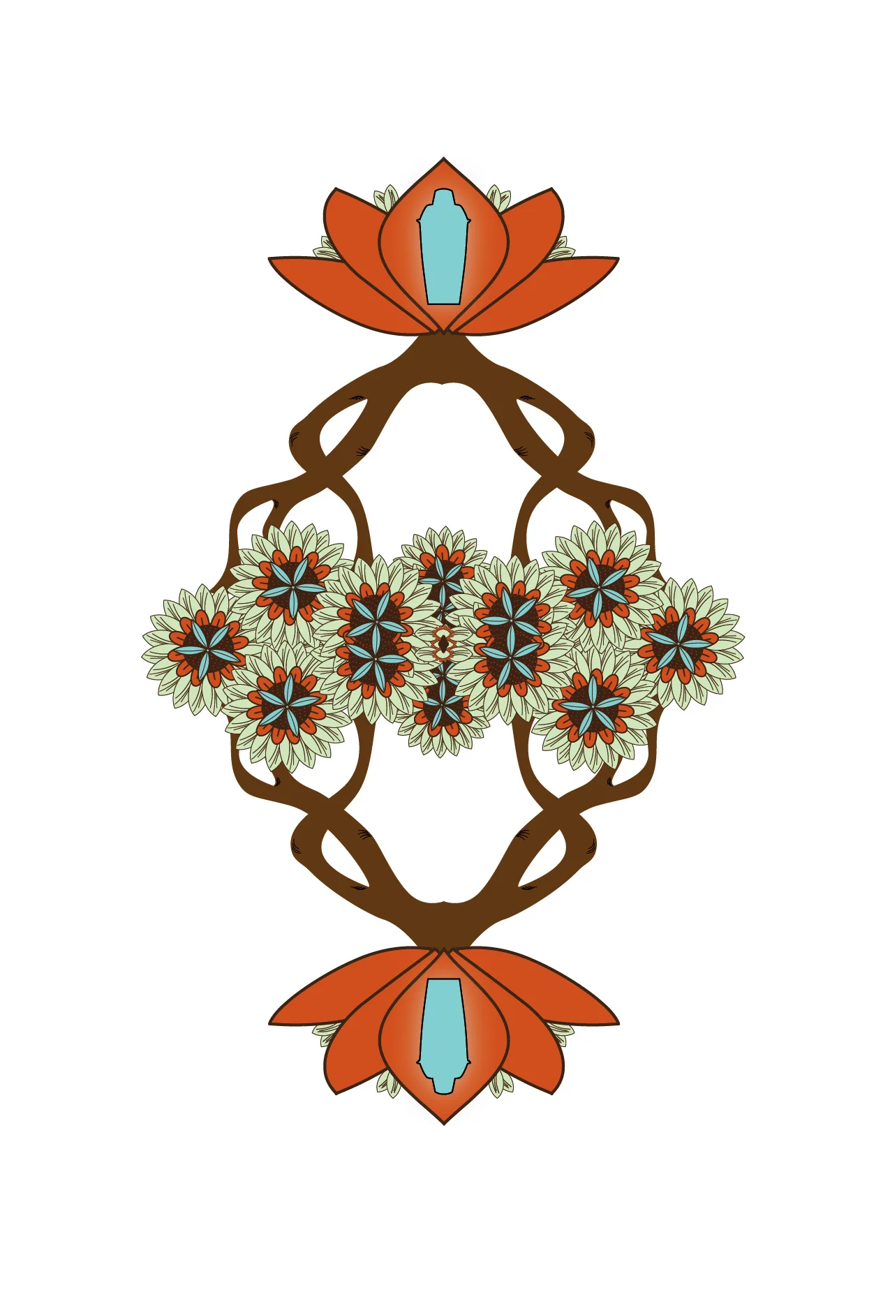
As a follow-up to the Route 66-themed menu that ran through the Fall 2015 season, The Silk Road offered a bookend to the concept of travel, focusing on the historic trade routes that connected Asia and Europe and the vast areas in-between. Encompassing such a wide array of cultures and visual identities, and in the absence of a specific A to B geographical route, the menu endeavors to create an overall sense of the exotic (relative to a Mid-Century domestic perspective) through vibrant colors and illustrations based on iconic pattern design from some of the world's essential birthplaces of art and culture. In a nod to the liquid interpretations of the subject matter, each illustration subtly incorporates a piece of barware.
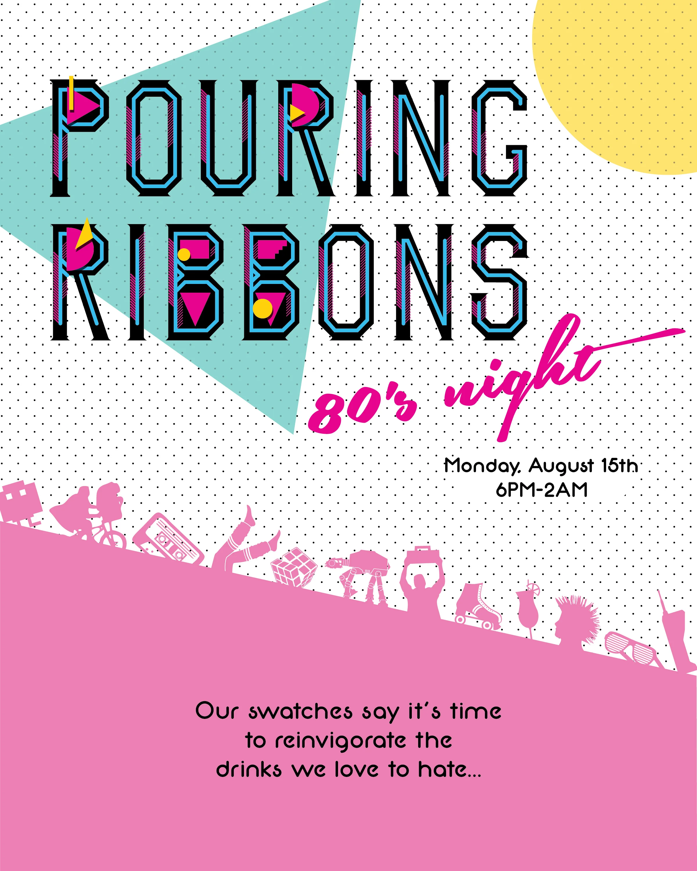
In order to advertise the newly launched Pouring Ribbons monthly 80s Night, it was necessary to create a poster template that could exist in a more generic form but within a three week project turn-around, could be tailored to any given month's theme and sponsors. The following series focuses on a cohesion of style that still uniquely represents each guest bartender's chosen theme. The posters were utilized both online and in print.
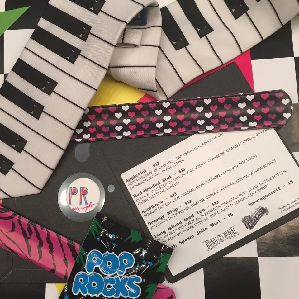
In 2016, Pouring Ribbons launched a monthly event geared towards reinvigorating classic drinks from the 1980s. One evening a month, a guest bartender joined the staff in cheekily featuring a film from the decade with a select list of cocktails and jello shots.
The light-hearted and temporary nature of this series allowed for specialty menus that could break out from the existing Pouring Ribbons menu structure to explore how guests respond to various formats, colors, and imagery. From floppy disks to Winnebago table tents, each menu endeavored to celebrate this iconic time period in a unique way.
Embracing the parameters of a simple bi-fold menu with a retro feel, this menu pulled inspiration from Mid-Century diners and the space’s marquee, stained-glass storefront.
A selection of posters advertising various special events at Pouring Ribbons.
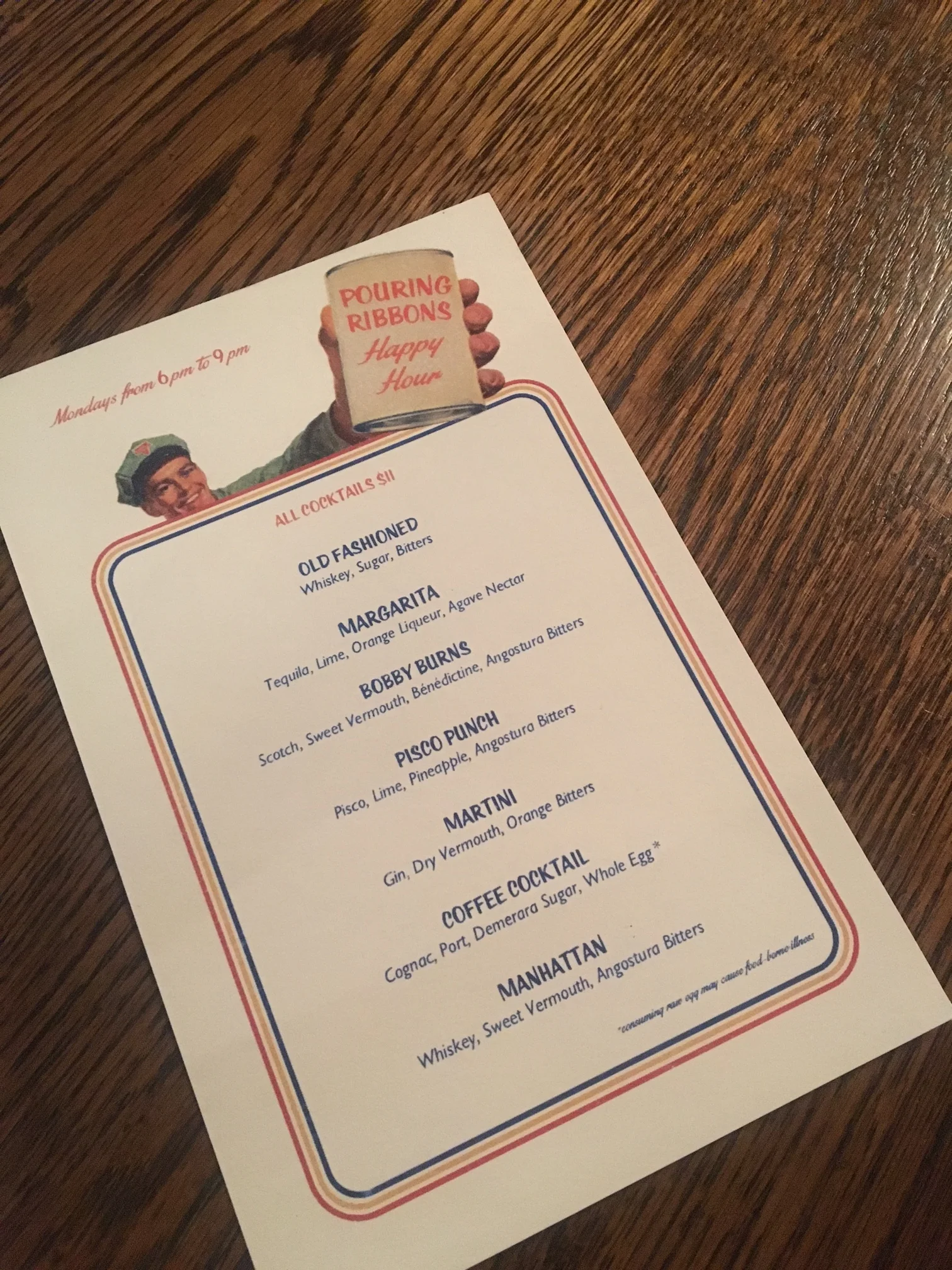
Although menus for special events may find themselves utilized for no more than a single night, by upholding standards concerning typography and layout, these print pieces can lend an added air of legitimacy to a carefully crafted - albeit temporary - cocktail list.
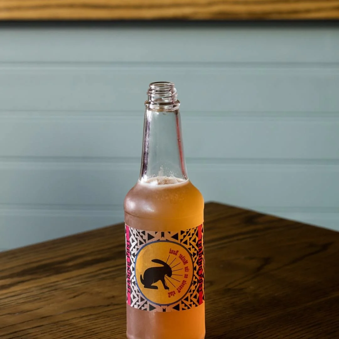
Designed for the Pouring Ribbons Route 66 Menu, this removable label pays homage to a famous roadside stop along the route. Intended to take advantage of the common—and often subconscious—inclination to fidget with a bottle's label, this print piece encourages removal with a message that can only be read from the reverse side, and aids in easy cleaning once the cocktail has been enjoyed.
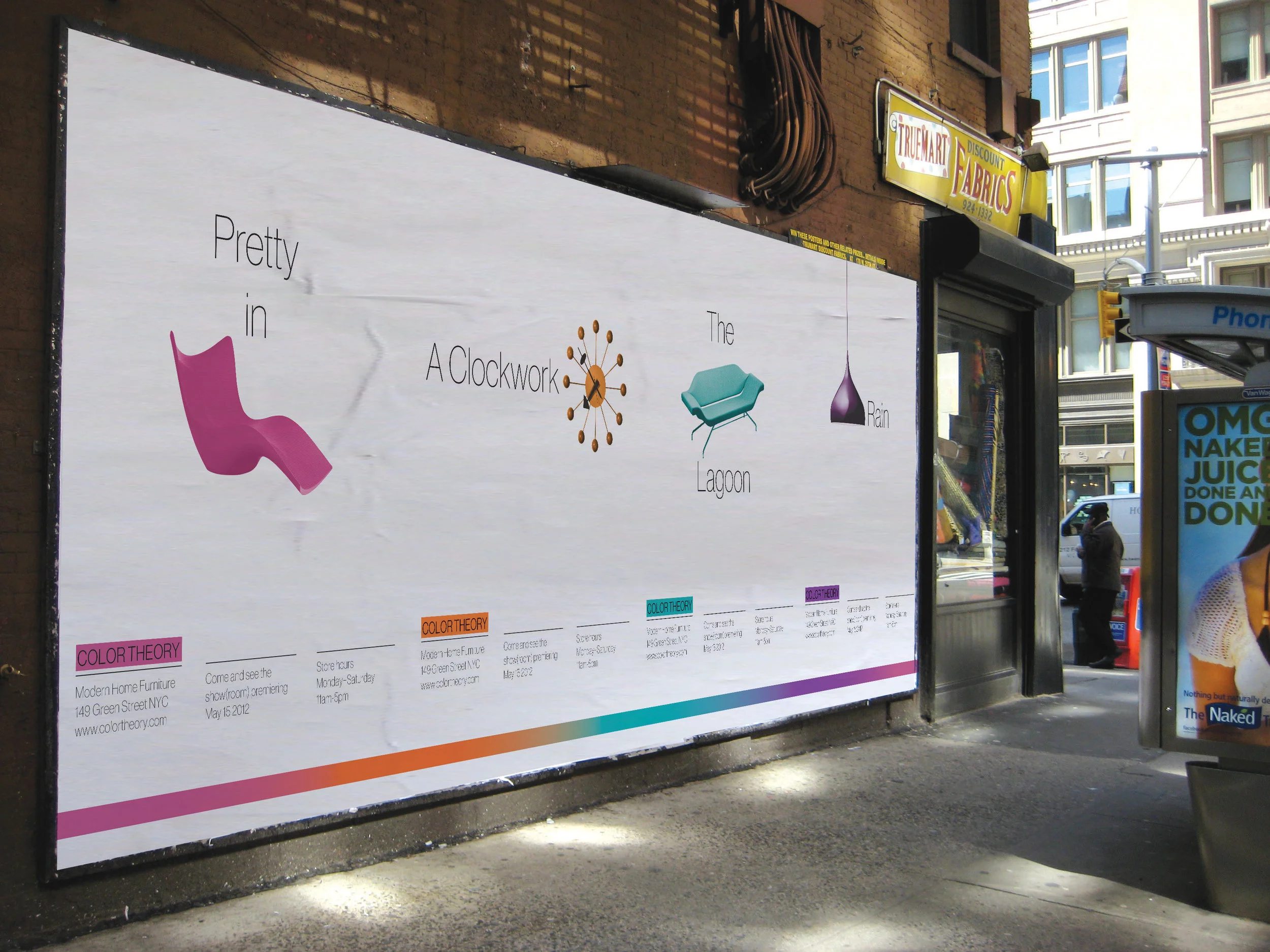
Created to advertise the debut of a theoretical modern furniture store, this set of four posters can exist individually or as a connected series.
In 2015, Pouring Ribbons hosted an event in collaboration with SherryFest, an annual, week-long celebration of my favorite category of fortified wine that included tastings, cocktail parties, and educational events. I was tasked with designing a focused menu for the eveningvbut wanted to create a print piece that would also serve as a commemorative keepsake. Making a zine seemed the perfect solution.
Given the freedom to act as editor and creative director of the piece, I selected sherry-forward cocktails from the entirety of the Pouring Ribbons catalogue that I felt represented an ideal spread of both mixing styles and sherry expressions. I then set about to reinterpret the core branding elements of Pouring Ribbons to create a more intimate and hand-made feel.
This marked my first opportunity to collaborate with an artist to achieve the visual tone I had in mind. With the help of talented barwoman and illustrator, Shannon Tebay, the zine utilizes a line-drawing interpretation of the Pouring Ribbons logo, a colored-pencil illustration of each featured cocktail, and a flip-book illustrative detail that runs the length of the menu. Textured paper and hand-sewn binding also contribute to the craftsmanship-forward association I hoped to align with the character of sherry itself.